Notehub Suggestive Search
Overview
Clients managing several connected IoT devices, in various Fleets, locations, configurations, routing events and consuming different amounts of data, should be able to search and find the information they need quickly and intuitively without being frustrated using search and having to manually scrolling through large amounts of data.
Problem
- - Current search system has limited functionality and is unintuitive to use
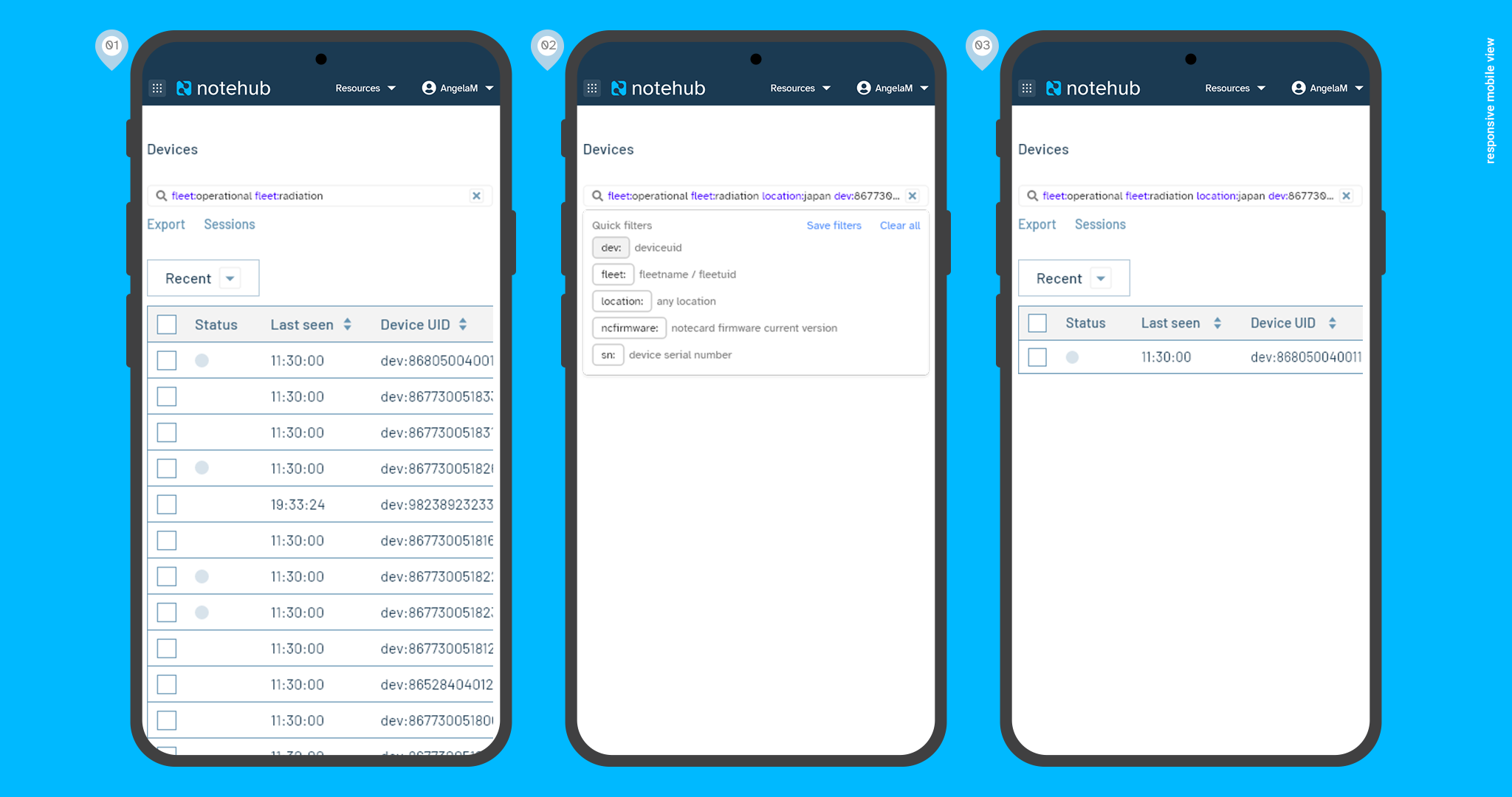
- - Search UI takes up a lot of top space on the page especially on mobile
- - There’s no proper documentation or help
- - User doesn’t know what they can or cannot search for
- - User cannot perform multiple search queries at once
- - Search query must match the exact format of item in database else yields no results
Objectives
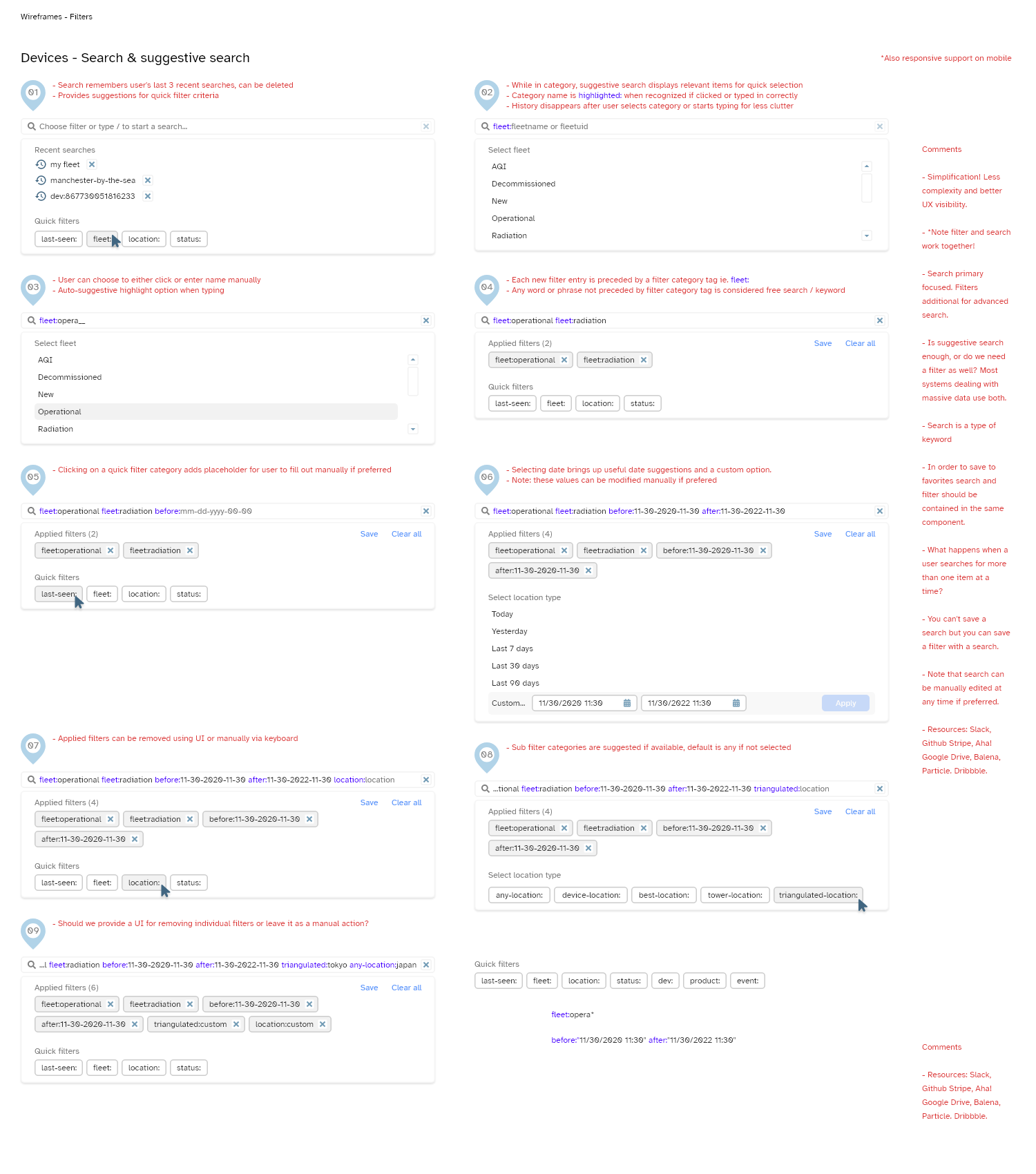
- - Upgrade to And/Or/Not Boolean search system
- - Ability for users to search for multiple items at once
- - Ability to save search query results
- - Add search query to URL so it can be copied and shared
- - Search must be modern, not complex and take up less space on desktop and mobile
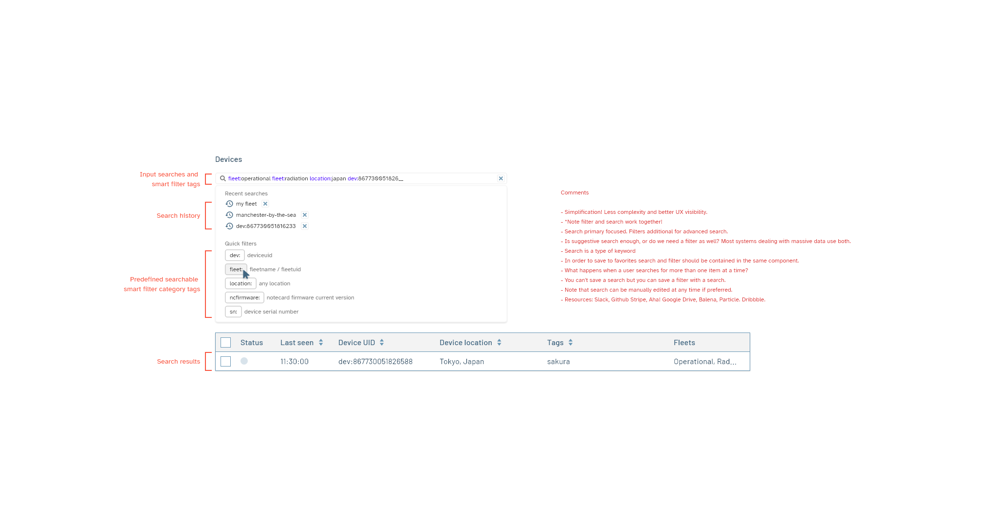
- - Search UI must be smart, intuitive and self-documenting
Research
Notehub processes tons of data; not being able to easily find what you’re looking for can have a significant negative impact on the usage of the application. In researching solutions for implementing a better search system I was inspired by Google search and Stripe suggestive search techniques. Users have the option to free search or follow the suggestive search prompts. When in focus, a user is presented with a dropdown list of tagged categories they can search from and their results are displayed as they type. It would utilize an ‘And’ Boolean search system so they can search for multiple items at once; the more they add the more refined the list.
Impact
After several rounds of reviews and usability testing, we discovered suggestive search became one of the most used features on the site as users could focus on exactly what they’re looking for instead of being frustrated about wasting time manually scrolling through tons of data.
Discovery


