Blues Brand Design
Challenge
Blues Wireless needs an official recognizable brand identity
Objectives
Research
In order to create a unique brand identity, I needed to define what Notehub is, who it is for, and how it can help automate and positively impact the lives of our potential customers. Also, it is necessary to define who are our target customers and competitors and what makes our product stand out.
Definition
A hosted service for securely routing Notecard data to your cloud application of choice. Manage fleets of devices, update host and Notecard firmware over-the-air.From the definition and a few brainstorming sessions with my team, I came up with keywords that encapsulate what the product is all about.
Keywords
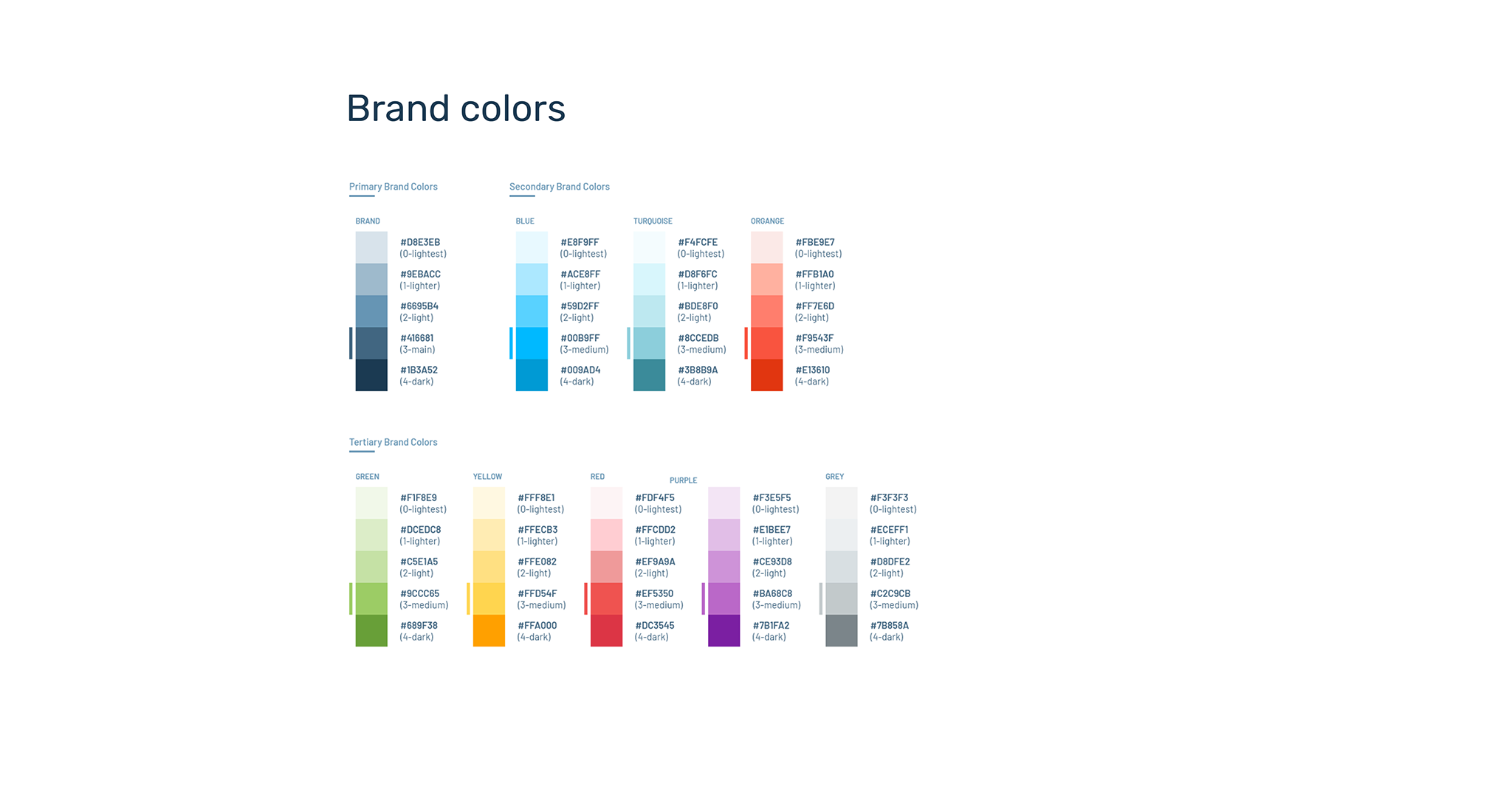
Notecard, Noteboard, IOT, AI, esp32, mobile, circuit, board, sensor, tracking, smart device, chip, mcu, control, wireless, remote, cloud, sync, json, network, card, automation, tracking, sensing, motherboard, technology, transfer, connection, communication, data, access.And then finally from the definition and keywords I brainstormed ideas for the brand logo, colors, and style guide.
Design
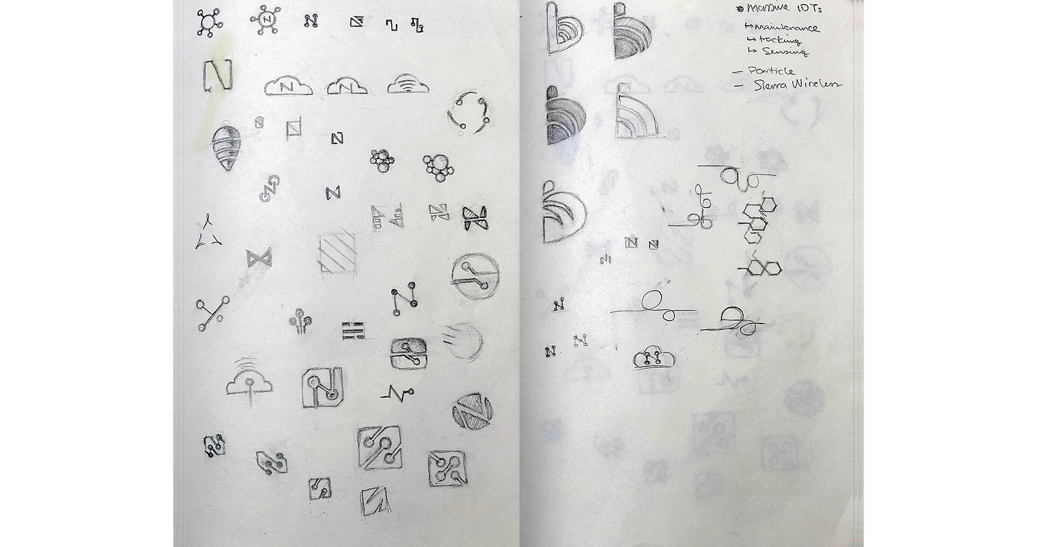
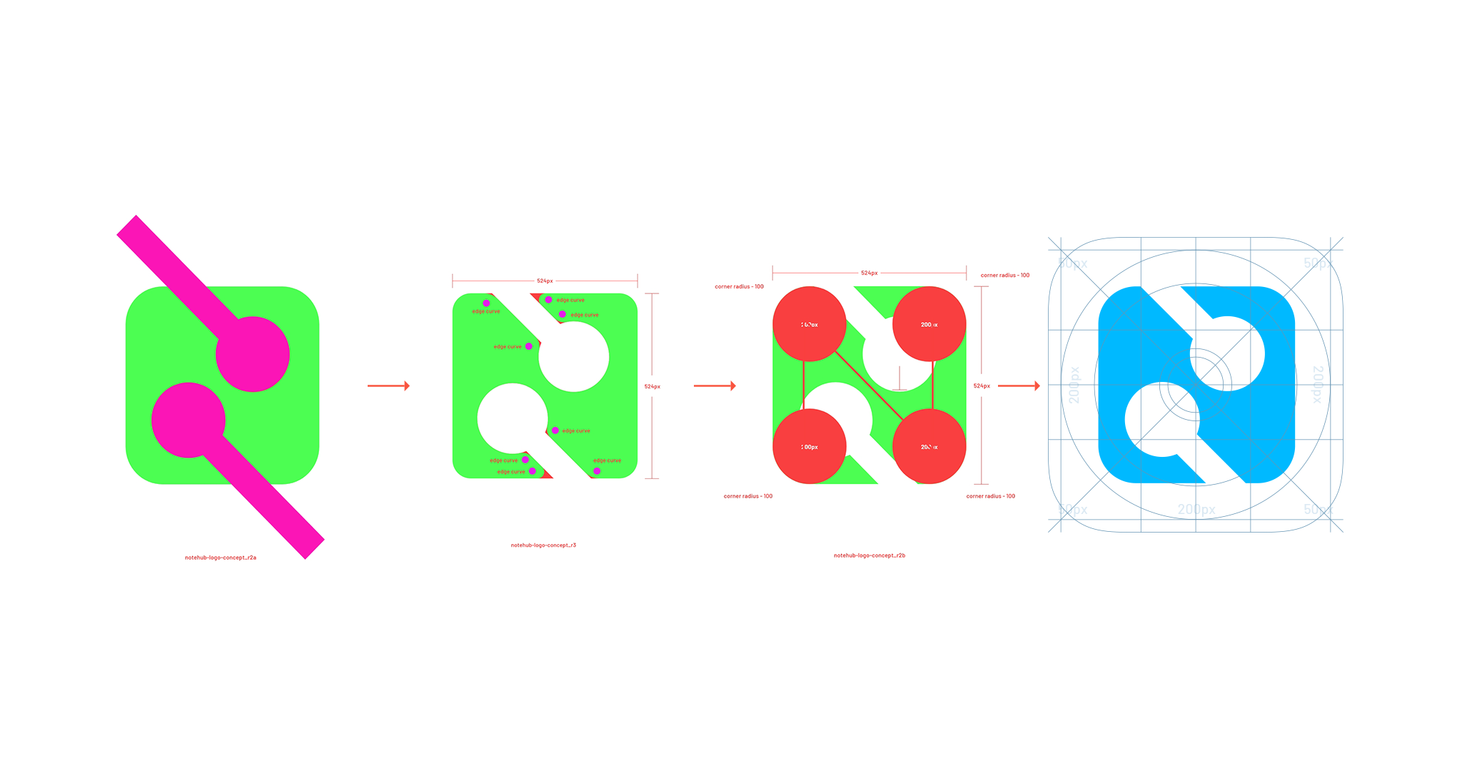
The idea was to create something iconic and representative of Notehub and smart IOT devices and so the concept design was centered around the letter N and dots connecting to each other. The dots pattern evolved into a circuit board forming the shape N. I went with a square instead of a circular shape to be more in alignment with a Notecard device. I adopted the rounded edges of the notecard to give it a softer more organic feel, which represent contemporary, mainstream, connection, community, and approachability and also makes it more recognizable at a distance.
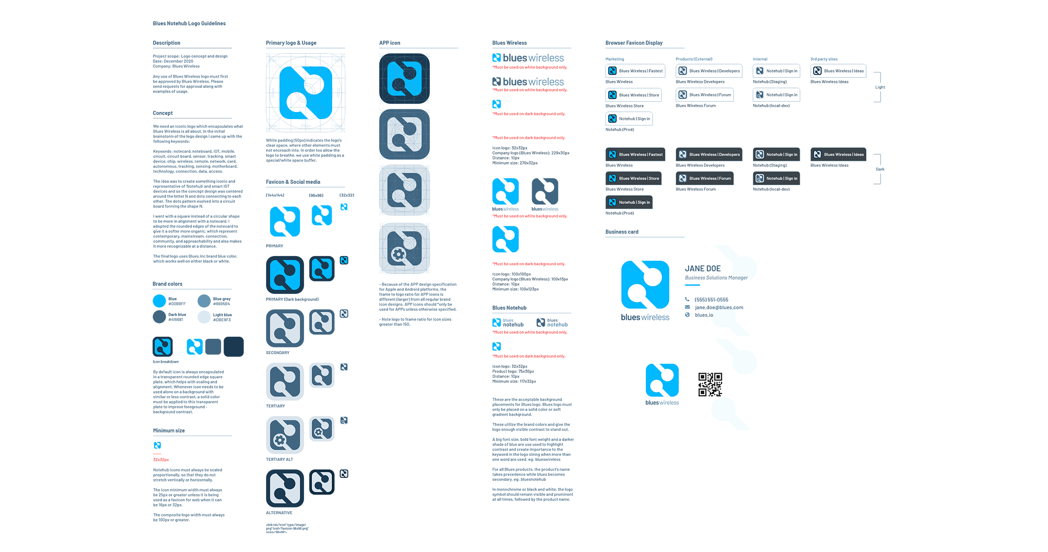
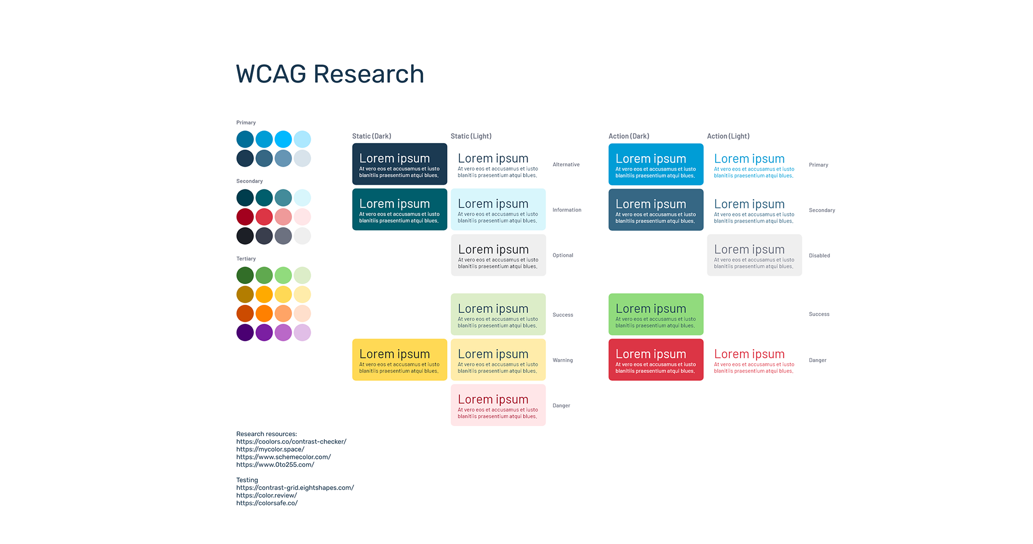
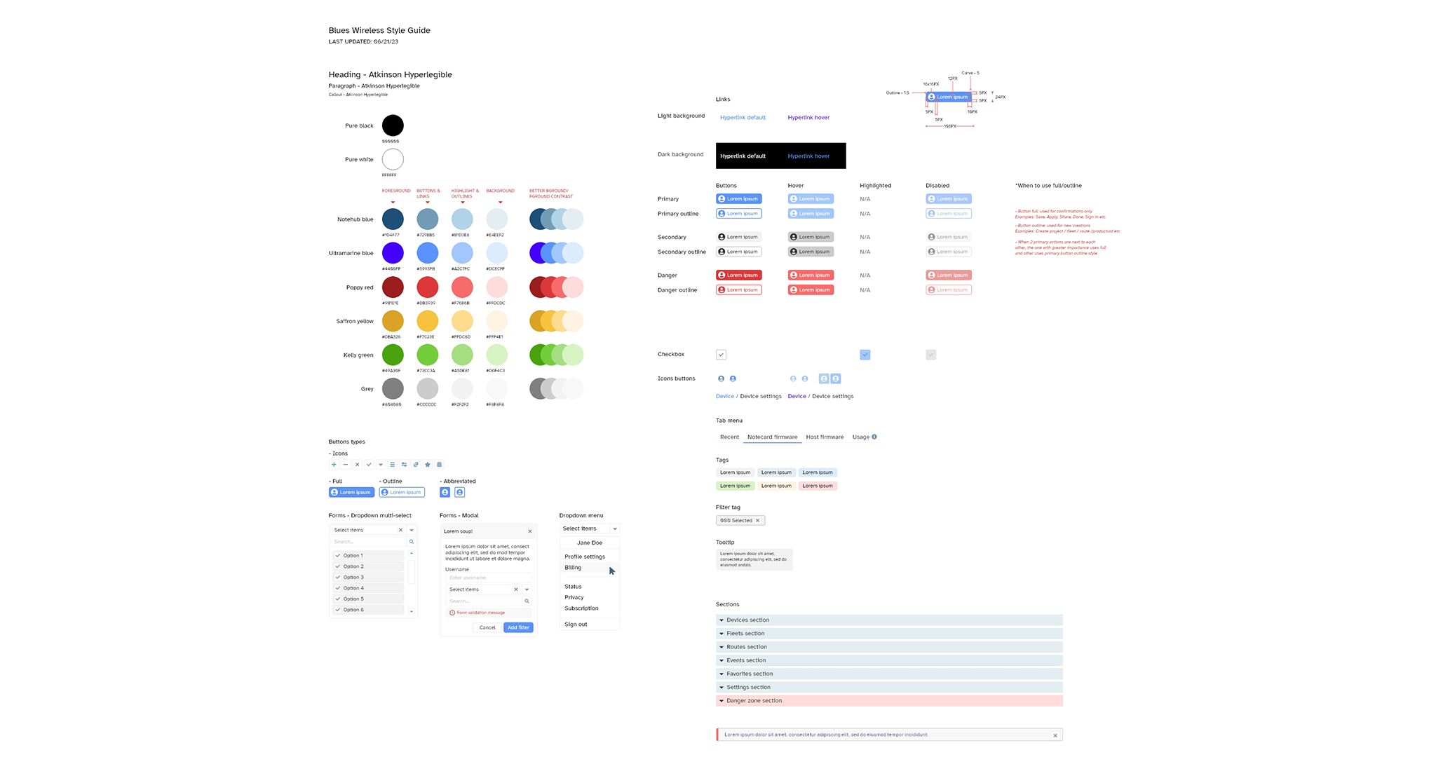
The general feedback for the initial sketches and color scheme was positive, however I needed to take a deeper dive into how the logo, colors, and design style represented the product and the overall company and write up a guide of how it would be used digitally and in print.
Impact
Having an official brand identity was a huge added value to the company and was greatly loved by all, internally and also our customers. It added a professional, trustworthy look and feel. It was recognizable which improved our marketing and social media presence and boosted traffic to the site.
Reflections
